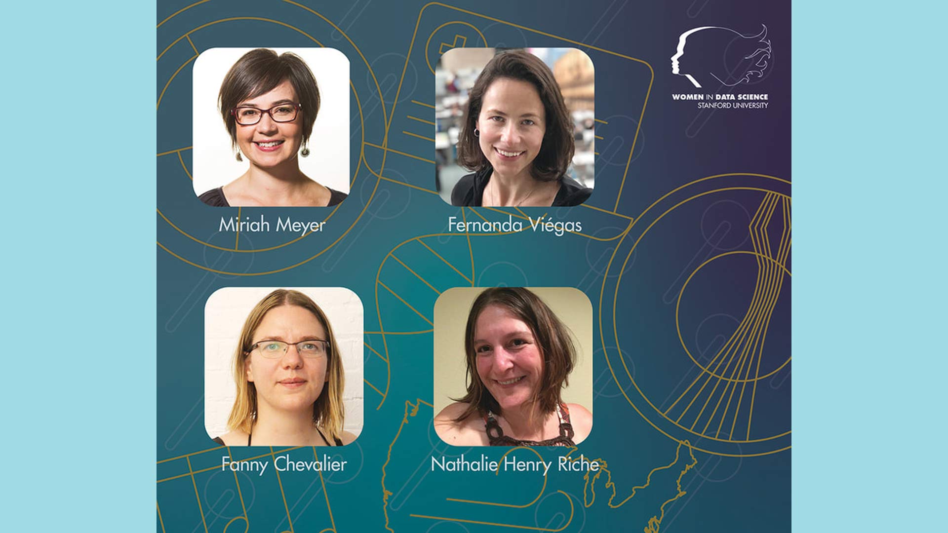
During the Women in Data Science (WiDS) Worldwide conference, Fernanda Viégas, Principal Scientist and co-leader of PAIR (People + AI Research) at Google, said that human beings are, “…pattern seeking machines…once we can visualize data we take advantage of innate capabilities…” to analyze information quickly. Fernanda showed the power of data visualizations by demonstrating the history flow of Wikipedia edits, an artistic representation of the city of Boston, as well as something that has no shape: wind.
At the WiDS conference at Stanford in 2020, Fanny Chevalier, Assistant Professor of Computer Science and Statistics at the University of Toronto, illustrates how data visualizations can provide shortcuts to gaining understanding from large data sets. In Fanny’s lab, she and her students develop interactive tools to provide these shortcuts, using techniques such as machine learning and natural language processing to decipher and find patterns in doctors’ notes or to help researchers detect characteristics for genetic diseases. Fanny also shows a few examples of how data visualizations can make data more relatable or, in other cases, create misleading assumptions.
Nathalie Henry Riche from Microsoft Research shows how data visualization helps you to answer questions that you didn’t know you had. During her talk, Nathalie showcased some visualization tools that started as research projects but then found their way into Microsoft products. She also demonstrated Datalink, her research collaboration with Fanny Chevalier, among others, that allows you to use touch and a stylus to create and manipulate data visualizations characteristics.
Designing visualization systems to help people make sense of complex data is the focus of Associate Professor, Miriah Meyer in her Visualization Design Lab at the University of Utah. During her talk, Miriah describes data visualization as, “… the mechanism that helps people bring their knowledge to bear and to make decisions.” Miriah demonstrated how MizBee, a multiscale synteny browser that she developed, along with collaborators, helps researchers explore complex genomics data. She showed how visualization was used during the entire process of scientific discovery, not just to create beautiful visualizations to complete a research paper. Miriah goes on to explain some foundational principles for creating effective visualizations.
Data visualization can be a powerful way to explain and gain knowledge about complex data sets. Thanks to Fernanda, Fanny, Nathalie, and Miriah, you now have some knowledge about the approaches, tools, and foundational principles for creating data visualizations to both explore and explain your data.
WiDS Posts | October 13, 2021
Data Visualization: Turning Information Into Images