With the massive amounts of data that are generated and collected today, data visualization is an invaluable tool to help people explore and understand what it all means. Data visualizations can be exploratory to help analyze the data and explanatory to present insights to a broader audience. Both art and science, data visualization turns information into images and helps people see patterns, trends, and outliers in large data sets. Here is a sampling of recent WiDS talks and workshops that delve into different aspects of data visualization.
Fernanda Viégas, Principal Scientist at Google and Harvard Professor, discusses a variety of ways in which data visualization can help people effectively engage with data: from generating scientific insight and enabling public debate to boosting artistic expression. In her WiDS talk, Data Visualization as Exploratory Medium: from Scientific Insight to Artistic Expression, Fernanda presents projects that illustrate how the coupling of visualization techniques and design thinking not only empowers experts, but also welcomes lay viewers into the world of data and statistics.
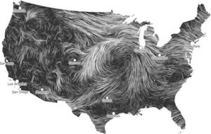
The project History Flow visualized the history and evolution of Wikipedia articles to understand how people came together to create pages, and highlights turning points like mass deletion and edit wars. She also describes the Wind Map project, where she and her collaborator Martin Wattenberg set out to visualize the invisible by creating a wind map of the United States. Using NOAA data, they created a live visualization of the wind patterns where you can see the direction and speed of the wind anywhere in the United States. What started as a creative project is now used all over the world to show wind patterns in professional websites.
Another WiDS workshop about data visualization that’s useful for those new to coding is Creating Data Visualizations with Spotify Data. Nicole Crosdale, a graduate student at the University of Florida, teaches you how to analyze your personal Spotify data, create visualizations, and prepare your data to be used in business processes. The visualization uses a Spotify dataset to create visuals displaying what day of the week most songs are streamed, top 10 songs, top 20 artists, and how many songs on a user’s playlists. This demonstration uses Python so a new coder will understand foundational coding syntax that can be used in other languages.
If you are interested in using data visualization to create a data dashboard, check out the WiDS Workshop Dashboard Design Thinking by Jenn Schilling, Senior Research Analyst at the University of Arizona, adjunct faculty member at the College for Creative Studies, and founder of Schilling Data Studio. She recommends applying design thinking to dashboard development to create dashboards that will provide insights to meet user needs. The workshop teaches you the six steps of design thinking (empathize, define, ideate, prototype, test, and implement), applies design thinking to dashboard design, details each step of the process for dashboard design, and then shares some examples of dashboard design thinking.
For more advanced approaches to data visualization, Pariza Kamboj, Professor at the Sarvajanik College of Engineering & Technology (SCET) presents the WiDS Workshop Effective & Ideal Data Presentation using Visualization Techniques & Lucid Perceptions. She says an ideal data visualization shows the right amount of data, in the right order, in the right visual form to convey what’s most important to the right audience and for the right purpose. The workshop outlines multiple types of visual graphing techniques for visualizing data. She says the right visualization comes from an understanding the context of the business, consumer needs, the nature of data, and the most appropriate techniques to present that data.
Data visualization is a crucial element of data science because it helps scientists, journalists, and artists tell engaging stories with data, whether it’s election returns, climate change impacts, or COVID-19 statistics. Visualizations help more people to engage with large, complex data sets, to gain a deeper understanding of the data-rich world we live in.